Facebook Ad Examples: 11 Campaigns Meta Documented, by Format
Eleven Facebook ad examples across image, carousel, collection, catalog and video, with the results Meta published, the dates and tests behind them, and one step to rebuild each for your product.

Mauricio Valdivia
·Updated ·12 min

2.28X in July, and the test behind it
Portland Leather Goods had a reporting problem. Its marketing director, Matt Fey, says the brand's multi-touch attribution didn't report lifts in in-store sales, despite the team seeing higher offline sales. So it ran image ads and partnership ads on Facebook and Instagram, bid toward in-store purchases around its 19 US stores, and let a conversion lift test from Meta settle the question. Meta reports a 2.28X incremental in-store return on ad spend for July 2026.
That number needs its fine print. It is the best of three monthly readings Meta reported for campaigns that ran April 1 to August 31, 2026: April came in at 1.51X and August at 1.85X, and the page gives no figure for May or June. It counts in-store sales only. And it is Meta's own measurement: Meta's conversion lift test, published by Meta, audited by no one else. It is still more than most Facebook ad examples give you: a result, a date range and the method behind the number.
This guide asks the same three things of every example. Below are 11 campaigns Meta documented on its own site, sorted by the format they ran in: image, carousel and collection, catalog, and video. Each gets the result Meta published, the dates and the test wherever Meta gives them, and one step to rebuild the mechanic for your product. For a general method of reading any ad layer by layer, our Instagram ad examples teardown sets out four questions. This is the Facebook companion, organized by format.
The five shapes a Facebook ad can take
Meta's Ads Guide files its specs under four formats: image, video, carousel and collection. Catalog ads make a fifth, of a different kind. Advantage+ catalog ads, in Meta's words, deliver product recommendations to people based on their interests: you upload a product catalog, and Meta's machine learning pulls the product images each person sees. This is how each one looks in Facebook Feed, from Meta's spec pages:
| Format | What the viewer sees | Feed spec Meta recommends |
|---|---|---|
| Image | One still image | 4:5, 1440 x 1800 |
| Video | One video | 4:5, 1440 x 1800 |
| Carousel | 2 to 10 swipeable cards | 1:1, at least 1080 x 1080 |
| Collection | Cover plus three products | 1.91:1 to 1:1 |
| Catalog | Products chosen per person | Pulled from your catalog |
Two things on those pages shape the examples below.
- A collection ad opens a page of its own. Meta's collection spec is a cover image or video followed by three product images, and a tap opens an Instant Experience, a full-screen landing page.
- The recommendations move. In May 2024 the same guide recommended 1:1 or 4:5 for Feed video; today it recommends a flat 4:5. Build to the page the week you build, and keep the full spec sheet handy: our guide to video ad specs by platform sets Meta's numbers beside five other networks.
Image ad examples: the picture was never the variable
Image ads are the cheapest format to make and the easiest to vary. Both image examples Meta documented make the same point from different sides: what moved the number was the system around the picture. For the format itself, what a static ad is and when one beats video has its own guide.
Portland Leather Goods: image ads that bid for the store
Portland ran omnichannel ads, which Meta describes as a way to optimize a single campaign for both online and in-store sales. On top, it used a value rule that gave it the choice to increase auction bidding to 100% for the in-store purchase conversion location. Every ad went to women aged 18 and over living within a 40-mile radius of each of its 19 retail locations across the US.
- Meta's result: 1.51X, 2.28X and 1.85X incremental in-store return on ad spend in April, July and August 2026. Fey says those three months gave the team the confidence to increase spend by 30%.
- Dates: April 1 to August 31, 2026.
- The test: a conversion lift test from Meta, counting in-store sales only.
Rebuild it. If your sales finish somewhere the ad platform cannot see, such as a store, a phone call or a showroom, fix the measurement before the creative. Decide which conversion you want more of, tell the auction, and judge the ads on a lift test rather than on attribution. Image ads are the cheap way to feed that test.
Casetify: a generated background, the same product
On May 7, 2024, Meta announced enhanced generative AI features for advertisers, building on its existing capabilities to generate new backgrounds around product images. In that post, Meta quoted Casetify's founder and CEO, Wesley Ng, on a test of its GenAI Background Generation feature.
- Reported result: a 13% increase in return on ad spend, in Casetify's own words.
- Dates: none given in the post.
- The test: Casetify's own. The post names no test design and no lift study.
Weigh that number differently from the rest of this guide. It is a lead, not a benchmark.
Rebuild it. Keep the product identical and change only the world around it: a desk, a gym bag, a car dashboard. That isolates one variable, the scene. You can run the same idea outside Ads Manager: in Novoads, the Image to Product Ad tool takes an uploaded product photo, lets you set the scene, people and lighting, and renders in 4:5, Meta's recommended Feed ratio, or 1:1 for carousel cards.
Carousel and collection examples: several products, one ad
A carousel gives you 2 to 10 cards; a collection gives you a cover and three product tiles. Neither example below ran its format alone, which matters for how you read the numbers.
Estée Lauder Turkey: a carousel inside a deliberate mix
To launch a new cream during its Advanced Night Repair Week, Estée Lauder Turkey ran five kinds of assets at once: creator-built videos, partnership ads, video ads made with computer-generated imagery, photo ads in the swipeable carousel format, and AI-enhanced Advantage+ catalog ads. They were aimed at women in Turkey aged 25 to 45, and every ad carried a Learn more or Shop now button.
- Meta's result: a 51% lift in incremental purchases, a 1.7X incremental return on ad spend, a 5.8-point lift in brand awareness and an 18% lift in paid search visits, reported for the whole mix rather than per format.
- Dates: September 12 to October 20, 2024.
- The test: a Meta brand lift study and a Meta conversion lift study with a search lift methodology.
Rebuild it. Give the carousel the job it is shaped for: several reasons in one ad, one card per claim. Run it beside your video and catalog ads rather than against them, and measure the mix with a lift study instead of crediting each format by last click.
H&M: collection ads built on product-level video
H&M had found in earlier studies that ad creative from traditional fashion photoshoots didn't resonate well with young female US audiences. For its summer campaign it moved to creators and packaged their footage into several formats: a paid partnership ad campaign with the awareness objective, and Advantage+ shopping campaigns. All the assets featured products that shoppers could explore in the collection ad format and product level video.
- Meta's result: a 94% lower cost per lift for brand consideration for campaigns featuring creators, compared to usual campaigns, and a 2X online and in-store incremental return on ad spend on top of the usual campaigns.
- Dates: June 1 to August 31, 2024.
- The test: Meta brand lift and conversion lift studies.
Rebuild it. Treat a collection ad as a storefront with a video in the window. Put motion in the cover slot, ideally a person using the product, and let the three tiles carry the catalog. A still product shot on white in the cover is a catalog ad with extra steps.
Catalog ad examples: when the feed picks the product
Catalog ads hand the casting to Meta: you supply the products, and the system chooses which to show each person. One example below makes the catalog the test. The other keeps it as the control.
Deapsigner: a catalog that keeps itself in sync
Deapsigner, a cross-border apparel business, often ran photo ads on Facebook and Instagram. Its team, which manages campaigns for several ecommerce businesses, had concerns about the time required for catalog setup and ongoing maintenance. Meta pointed it to a Commerce Manager option that uses the website as a data source and adds new products to the catalog automatically.
- Meta's result: a 24% lower cost per purchase and a 6.2% higher clickthrough rate for the catalog ads with automatically added products, compared to the usual campaign.
- Dates: June 3 to 24, 2025.
- The test: an A/B test in Meta Ads Manager.
Rebuild it. Copy the test exactly, and fix the feed before the creative:
- Put your usual ads in one cell and catalog ads in the other.
- Run it as an A/B test in Ads Manager for about three weeks.
- Keep the catalog in sync with your website. A catalog that lags shows people products they cannot buy.
bonprix: catalog ads as the control, creator video as the test
bonprix, the German fashion retailer, shows the catalog from the other side. It wanted more consideration for its denim among women in Germany, especially loyal core shoppers aged 40 and above. Its usual campaigns ran catalog ads with photos, and a team lead says that static catalog creative wasn't shifting consideration. So bonprix sourced inclusive fashion creators who reflected the diversity of its audience, and its agency produced 22 creator-led videos showing the denim range across body types and fits.
- Meta's result: a 13% lower cost per purchase and a 1.4X incremental return on ad spend with 30% of budget on creator-led partnership ads and 70% on the usual catalog ads, versus 100% on catalog ads.
- Dates: October 23 to November 6, 2025.
- The test: a multi-cell conversion lift test.
Rebuild it. Write down the sentence your buyer says before declining. If it is about fit, size, skin type or room size, one hero image cannot answer it and a range can. Cast the objection, produce the spread, and add it beside the catalog rather than in place of it. The UGC ad examples worth studying are built the same way.
Video ad examples: five campaigns, five levers
Video carries the most examples here, and one rule from Meta's Facebook Feed video spec is worth knowing before you read them. If you choose awareness as the objective, or a performance goal such as maximizing reach or 2-second continuous video views, the headline, description and call-to-action button won't be displayed on Facebook Feed on mobile. The video has to open, argue and ask on its own.
Instamart: the same video, sent from a creator's handle
For Valentine's week, Instamart, a quick-commerce platform in India, asked local nano creators to develop storytelling concepts about its fast delivery of gifts. It then ran the identical videos as standard video ads in one cell, and as partnership ads, which go out via each creator's handle as well as the brand's, in the other.
- Meta's result: 25.4% more in-app subscriptions and a 17% lower cost per in-app subscription with partnership ads, compared to standard video ads.
- Dates: February 6 to 14, 2026.
- The test: an A/B test in Meta Ads Manager, with the creative, the audience and the budget the same in both cells.
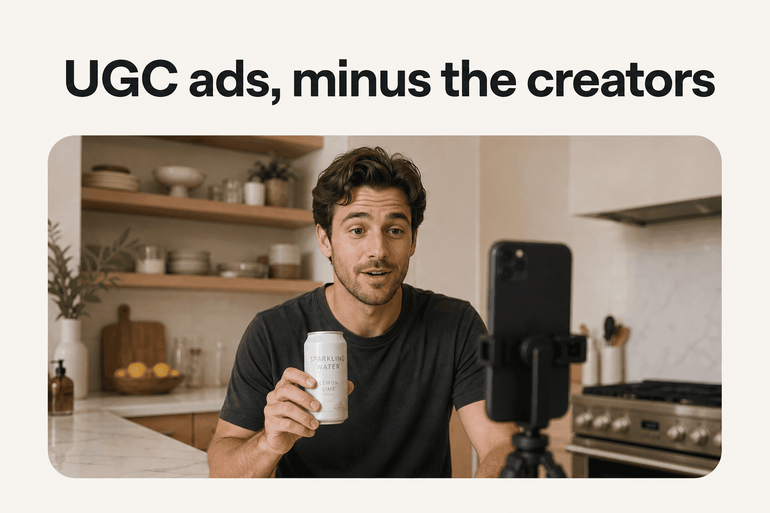
Rebuild it. Before you commission a fourth version of a clip that already works, change who sends it, and hold creative, audience and budget constant. It costs a campaign setup, not a production day. Who appears to be saying it is a creative decision, and the same idea sits behind UGC style ads.
Boden: a four-day burst built for full screen
Boden wanted US awareness for its spring and summer collection and bought it as an intensive four-day blast: a Moment Maker campaign, which Meta describes as delivering ads across placements on Facebook and Instagram in a multi-day burst, booked ahead with reservation buying. Every ad was a creator video built to three rules: full-screen vertical 9:16, sound on, and the main marketing messages kept within the safe zone.
- Meta's result: a 32.4-point lift in purchase intent and a 43.5-point lift in brand awareness.
- Dates: February 24 to 27, 2026.
- The test: a brand lift test from Meta.
Rebuild it. Master for the placement instead of cropping into it:
- Build the edit at the placement's own ratio, not by trimming a 16:9 file.
- Lay the app's caption bar, profile row and buttons over your final frame in a mockup.
- Move any message that sits under them. Too many teams find the safe zone after launch, from a screenshot.
BYD: understood in the first seconds
BYD ran creator-led partnership ads in Reels to launch new models in the UK. Creators filmed vehicle interiors and exteriors, some of it point-of-view footage shot on Ray-Ban Meta AI glasses. One line in the team's creative checklist is worth stealing: ads should be easy to understand from the very first seconds with text overlays.
- Meta's result: a 19.7-point lift in awareness of the SEAL U DM-i model and a 14% increase in Google search driven by Meta.
- Dates: August 31 to October 1, 2025.
- The test: brand lift and conversion lift tests from Meta.
Rebuild it. Write the four or five words on frame one before you write any dialogue, then test them:
- Name it, do not tease it. A stranger should know the product category from the overlay alone.
- Read it at arm's length, muted. That is the real viewing condition, not your edit suite.
- Assume no headline. On an awareness buy in Feed, the copy underneath may not render. Our guide to ad hooks covers the writing.
Rexona Australia: a launch only locals fully get
To launch a whole body deodorant, Rexona generated videos on a large scale with the help of CGI technology. They reimagined eight famous Australian landmarks, including Parliament House and the Barossa Valley, with cheeky humor and local slang, and ran across Facebook and Instagram in Feed, Reels and Stories.
- Meta's result: a 6-point lift in ad recall, and a 37% higher lift in ad recall than the brand's usual campaign.
- Dates: October 1 to November 2, 2025, the window Meta gives for its testing.
- The test: a multi-cell brand lift test from Meta, plus a buzz lift study.
Rebuild it. Keep the script and change the world: a landmark, a street, a shop interior, the words locals actually use. Generate two or three local backdrops before you commit to one global master. It is the cheapest way to learn whether flat results are a creative problem or a relevance problem.

GUMAC: a Feed video that ends in Messenger
GUMAC, a Vietnamese fashion brand, streams an average of twice daily and relies on Facebook for 60% to 70% of its online orders. Its live shopping ads in Facebook Feed carry a Send message button. Tap it and you join an automated Messenger conversation where you can keep watching, browse products in an overlay, and check out without leaving the thread. The change GUMAC tested was the optimization goal: purchases instead of views.
- Meta's result: 6.8X higher return on ad spend and a 5.2X lower cost per purchase when optimizing for purchases.
- Dates: December 25 to 29, 2025.
- The test: a five-day A/B test in Ads Manager.
Rebuild it. Decide where the viewer lands before you brief the video:
- Cold viewer, three seconds in. Not ready for a checkout page. Ask for the next view.
- Product with an open question. Size, fit or delivery closes better in a conversation than on a page.
- Judge it on purchases. Not on clicks, the trap we unpack in does a high CTR mean good ads.
What the strongest Facebook ad examples share
Strip away the brands and the formats, and three habits repeat across these eleven.
A control, not a before-and-after
Ten of the eleven results come from a Meta test with a comparison built in:
- A/B tests in Ads Manager: Instamart, Deapsigner and GUMAC.
- Conversion lift tests: Portland Leather Goods and bonprix.
- Brand lift tests: Boden and Rexona.
- Brand and conversion lift together: Estée Lauder, H&M and BYD.
The eleventh, Casetify, is a founder's quote. That split is the most useful filter you can apply to any ad example you find. A number with no control is a story. Sizing the budget for a test of your own is its own question, and our breakdown of what Meta ads cost works through it.
One change at a time
The cleanest tests changed a single thing: the sending handle for Instamart, the optimization goal for GUMAC, catalog ads fed from the website for Deapsigner, a budget split for bonprix. The mixed campaigns, Estée Lauder and H&M, report results for the mix, so they tell you a combination worked, not which part of it did.
Range, often with a creator's handle on it
Seven of the eleven ran partnership ads somewhere in the mix: Portland Leather Goods, Estée Lauder, H&M, Instamart, bonprix, Boden and BYD. Only Instamart isolated the handle as the variable, so treat the count as a pattern, not proof. The broader habit is range: 22 bonprix cuts, eight Rexona landmarks, five Estée Lauder asset types. Why Meta's delivery system treats look-alike ads as one creative is the subject of our piece on creative diversity in Meta ads.
An ad example without a control is an anecdote
Every campaign above has ended, and the specs Meta recommends have moved since some of them ran. What transfers is the test: the one variable each brand changed and the control it measured against. A folder of screenshots ages into nothing. A list of tested levers turns into next quarter's plan.
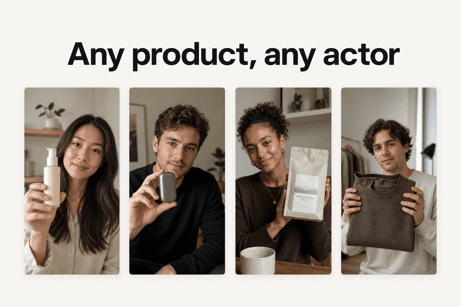
The part that stalls most teams is producing the variants those tests need: the second scene, the third overlay, the range of faces. Novoads is built for that step. Upload a product photo or write a script, pick an AI actor, and get video ads in vertical, square or horizontal, or ad images in 4:5, then run them against the ad you already have.
Frequently Asked Questions
What does an ad look like on Facebook?
It depends on the format. Meta's Ads Guide sorts Facebook ad specs into image, video, carousel and collection. In Facebook Feed, Meta recommends a 4:5 image or video at 1440 x 1800 pixels. A carousel holds 2 to 10 swipeable cards, recommended at 1:1. A collection shows a cover image or video followed by three product images, and a tap opens a full-screen Instant Experience. Catalog ads, the fifth thing advertisers call a format, pull product images from your catalog and pick which products each person sees.
What kind of ads are most successful on Facebook?
In the Meta case studies collected here, the result came from a tested change more often than from the format itself. Instamart got 25.4% more in-app subscriptions by running identical creator videos as partnership ads instead of standard video ads, in an A/B test from February 6 to 14, 2026. Deapsigner saw a 24% lower cost per purchase from catalog ads that add products automatically, in an A/B test from June 3 to 24, 2025. GUMAC saw 6.8X higher return on ad spend after optimizing its live shopping ads for purchases instead of views, in an A/B test from December 25 to 29, 2025. Choose the format your product needs, then test one change against a control.
Where can I find real Facebook ad examples?
Start with Meta's own case study library at facebook.com/business/success. Each case study names the brand, its goal, the ads it ran and the result, and the useful ones also state the campaign dates and the test Meta used, such as an A/B test in Ads Manager or a conversion lift study. The other primary source is Meta's Ad Library, and our Instagram ad examples guide shows how to read a listing there. A screenshot in a listicle with no date and no source tells you neither the result nor the method.
How do I rebuild a Facebook ad example for my own product?
Write down the lever, not the shot list: what changed (the sending handle, the bid, the catalog, the cover video, the first-frame text), what it was tested against, and which result moved. Then rewrite that one change for your product and make several versions, so the test has something to choose between. With an AI ad tool such as Novoads you upload a product photo or write a script, pick an AI actor, and get vertical, square or horizontal video ads, or ad images in 4:5, which makes producing a set of variants practical.
Key Takeaways
- A Facebook ad example is worth copying when it comes with a result, the campaign dates and the test behind the number. Every example in this guide is one Meta documented on its own site.
- Meta reports that Portland Leather Goods saw a 2.28X incremental in-store return on ad spend for July 2026. It is the best of three monthly readings from Meta's own conversion lift test, and it counts in-store sales only.
- Meta's Ads Guide files Facebook ad specs under image, video, carousel and collection. Catalog ads pull product images from your catalog and choose which products each person sees.
- The cleanest tests changed one thing against a control: the sending handle for Instamart, the optimization goal for GUMAC, catalog ads fed from its website for Deapsigner and a budget split for bonprix.
- Ten of the eleven results come from a Meta A/B test or lift study. Casetify's 13% gain in return on ad spend is a founder's quote inside a Meta announcement, so read it as a lead, not a benchmark.