Static Ads: What They Are, Examples, and How to Make Them With AI
Static ads are paid ads built from one still image. The format each platform sells, examples with published results, when a static beats video, the sizes Meta recommends, and four 4:5 statics we made in Novoads for 8 credits.

Mauricio Valdivia
·11 min
One still frame has to do all the selling
Static ads are paid ads built from a single still image: a photo or graphic with the headline, the product and the offer fixed in the frame, with no motion and no sound. They run in social feeds, on Pinterest and LinkedIn, across display networks and on billboards, and the viewer has to get the whole message in one look.
That constraint is the craft. On 2026-10-20 we asked Novoads for four statics in one go: an amber candle jar on a limestone bath ledge, under the headline "Light it. Slow down." Four usable 4:5 images came back in 35 to 52 seconds, for 8 credits in all, with every word spelled the way we typed it.
This guide covers the format each platform sells, three examples with the results their platforms published (one of them a case where the static lost), when a static beats video, the sizes Meta recommends, and the candle run itself, prompt included.
What counts as a static ad, platform by platform
Every big ad platform sells a single-image format under its own name, and the way each one describes it says what the platform expects the image to do.
The single-image format on each platform
- Meta sorts its Ads Guide into image, video, carousel and collection, and its ad-formats page calls photo ads "a clean, simple format to feature engaging imagery and copy."
- LinkedIn says marketers use single image ads "to drive focused engagement with a clear message, a strong visual, and a single call to action."
- Pinterest offers ad formats "from a static image to a multi-image collection or video", and its standard ads "feature only one image", ideally at 2:3 and 1000 x 1500 pixels.
- Snapchat tells newcomers: "If you're just starting out, we recommend a single image or video ad."
- Print and out-of-home, the posters, magazine pages and billboards the format grew out of, follow the same rule: one idea, read at a glance.
We read all four platforms' pages on 2026-10-20. Their descriptions stress the same few things: a clean format, a clear message, one call to action, a quick start. That is the job to give a single image.
The creative formats that recur inside the frame
Inside that one frame, the same handful of creative formats keeps coming back:
- Product hero. The product alone on a clean set, lit like a catalog photo. It works when the product itself is the reason to buy.
- Lifestyle. A person using the product. Meta's photo-ads page advises showing "images of people benefiting from your product, rather than just the product itself."
- Flat-lay with callouts. The product from above, with labeled features or props around it.
- Offer. The price, the discount or the bundle is the picture.
- Review card. A customer's sentence set as the headline, often beside a star rating.
- Comparison. Before and after, or yours against the usual alternative.
- Carousel. Several statics in one ad: Meta's carousel holds "up to ten images or videos in a single ad, each with its own link."
Four formats, one product, rendered in Novoads
 Nano Banana Pro · four formats for one product, our merch cap with Spanish headlines: studio hero, street portrait, desk flat-lay, billboard · 5 credits each at the September price (2 today) · rendered 2026-09-01
The strip shows four of those formats for one product, our own merch cap: a studio product hero, a street portrait, a desk flat-lay with callouts and a billboard on a street. Each tile is one Nano Banana Pro image made in Novoads on 2026-09-01, with the headlines in Spanish. Side by side, the four are different ideas, not different crops, and that difference starts to matter once Meta groups look-alike ads, which the candle run below runs straight into.
Static ad examples, with the results their platforms published
Lists of static ad examples usually show the ad and skip the outcome. The three below come from the platforms' own case pages, each with the number the platform published, and the second is a case where the static lost.
MHR on LinkedIn: a mascot static that warmed up the audience
MHR, a UK and Ireland provider of HR, payroll and finance software, introduced a refreshed brand in May 2022. On LinkedIn it relied on Single Image Ads for top-funnel awareness, with its new brand mascot featured front and centre, and made them vertical-first, citing its own insight that 71% of paid media clicks come from mobile devices. It then retargeted the people who engaged with those statics in a lead-generation campaign. LinkedIn's case study reports a 68% increase in lead volume and a 74% decrease in cost per lead.
Those two numbers belong to the whole program, which also ran Conversation Ads, not to the statics alone. Our reading: the static did the job statics do cheapest, making a brand familiar to a wide audience so the next ad had warmer people to ask.
Tilt Metrics on LinkedIn: when the static was the wrong container
Tilt Metrics, a US agency that runs lead generation for B2B software and service companies, promoted its clients' guides and eBooks with Single Image Ads, which sent people off LinkedIn to read the document. It then kept the same document, audience and campaign setup and swapped the statics for Document Ads, which let people read the content in the feed. LinkedIn's case study, which carries no date, reports 85% more high-intent leads at a 52% lower cost.
A static can only point at the thing you sell. When the thing you sell is information, a format that shows a piece of it wins.
Meta's 2014 test: statics for the visit, video then static for the sale
Meta's photo-ads page still backs its traffic claim with a single study, Facebook IQ's "Creative Combinations That Work", published on February 9, 2015. Over 8 days in November 2014, Facebook ran a test for one US advertiser in desktop and mobile News Feed. Three groups each saw one ad in each of two four-day phases: a video then a static, a static then a video, or two statics, while a control group saw no ads from the advertiser.
- Traffic: the two-static sequence "outperformed the other strategies on driving unique traffic with a 75% higher likelihood than the control."
- Sales: for online transactions, the advertiser's main metric, a video followed by a static did best, and that group was 31% more likely to buy online than the control.
It is one advertiser, tested more than a decade ago, so read it as a direction, not a benchmark. The direction is the useful part: the static brought the visit, and the sale came when video went first.
Meta's own documented image-ad campaigns are torn down in our Facebook ad examples, and the offer-led static gets its teardown in Instagram ad examples.
Static or video: when each one wins
Neither format wins in general. Each wins at a job, and the platforms' own pages say which.
Run a static when
- The goal is clicks to a site. Two statics in a row won on traffic in Meta's 2014 test, and Meta's photo-ads page still names driving people to your site as a photo ad's first job.
- You need the ad today. Meta notes you can make a photo ad "right from your Facebook Page by publishing and boosting a post with an image."
- The offer fits one look. Meta's advice is to "have a single focal point", and to consider carousel or video ads when one image has to hold too many things.
- You are testing angles at volume. In Novoads a 2K Nano Banana Pro static costs 2 credits and an eight-second Google Veo 3.1 clip costs 72, so one clip costs as much as 36 statics. We priced that trade in detail in Seedance vs Nano Banana for ads.
- You are building the audience a retargeting ad will ask. That is the job the MHR statics did.
Run video when
- The product has to move to make sense. Even Meta's spec page for Facebook Feed image ads says: "To capture attention quickly, use movement and sound to show the unique features of a product or tell your brand story."
- The story needs time. Meta's ad-formats page pitches video as the way to "Tell your story with sight, sound and motion."
- You want the sale, not just the visit. In the same 2014 test, a video followed by a static drove the most online transactions.
- What you sell is information. Tilt Metrics' document ads beat its statics because readers could see the content before handing over their details.
When the product needs a demo, an AI product demo video does what a still cannot, and the patterns that work on camera are in our UGC ad examples.
Or let delivery choose for each person
Meta's Flexible ad format lets you "select up to 10 images and videos in a single ad campaign, and the ad delivery system will automatically determine what media or media combination, such as single image, video or carousel, to show to people." Its December 16, 2025 note on creative diversification goes further and recommends "a broad portfolio of assets that take more creative liberty across text, image, and video."
Our stance: for most accounts the answer is both. Statics carry the angle tests because they are cheap and fast, one video carries the product that needs to move, and delivery decides who sees which. Both can come out of the same five steps for making a video or image ad with AI.
Static ad sizes and text limits
Facebook and Instagram Feed: 4:5 at 1440 x 1800
Meta's Ads Guide recommends 1440 x 1800 pixels (4:5) for Facebook Feed image ads, as a JPG or PNG. That is a recommendation, not a requirement: the same page's technical requirements set a floor of 600 pixels wide and 750 pixels tall at 4:5, a 30MB maximum file size and a 3% aspect-ratio tolerance. The Instagram Feed page recommends the same 4:5 at 1440 x 1800.
Other shapes still run in Feed. A note on the guide's ratio line says ratios from 1.91:1 to 4:5 are supported but "may be masked to 4:5", and that on desktop Facebook Feed an image may show at 1:1 with black bars on the sides. Make the 4:5 version first, since it is the ratio the guide recommends and the one other Feed shapes may be masked to.
Stories and Reels: 9:16 at 1440 x 2560, minus the safe zones
For Facebook Stories, Instagram Stories and Instagram Reels, the guide recommends 9:16 at 1440 x 2560 pixels and asks you to leave roughly 14% of the top, 35% of the bottom and 6% of each side clear of text, logos and other key elements, so the profile icon and the call-to-action do not cover them. A static in Facebook Stories shows for eight seconds, or until the viewer swipes away.
| Placement | Ratio | Recommended size |
|---|---|---|
| Facebook Feed | 4:5 | 1440 x 1800 |
| Instagram Feed | 4:5 | 1440 x 1800 |
| Facebook and Instagram Stories | 9:16 | 1440 x 2560 |
| Instagram Reels | 9:16 | 1440 x 2560 |
| Pinterest standard ad | 2:3 | 1000 x 1500 |
We read every row on the platform's own spec page on 2026-10-20. Treat the 9:16 version as a second render, not a crop of the 4:5 one: cutting a 4:5 frame down to 9:16 removes its sides, and the safe zones then take the top and bottom. The video side of the same placements is in our video ad specs by platform.
Text: Meta and Pinterest pull in different directions
Meta's Feed page recommends 50 to 150 characters of primary text and a 27-character headline; its Instagram Feed page says 125 and 40. On the image itself, the two platforms disagree. Meta's photo-ads page warns that "too much copy is distracting and can lead to your ad being shown to fewer people." Pinterest's guide to lower-funnel creative, dated 22 May 2024, says text overlay can "grab attention and make the offer more enticing or relevant", as long as the font is big enough to read.
Our rule from both: one headline of a few words, set large, and everything else in the ad's text fields.
How Novoads makes static ads: one prompt, four 4:5 variants
The run, as it happened
On 2026-10-20 we sent one image generation to Novoads with Nano Banana Pro, 2K resolution, a 4:5 ratio and four images, and this prompt, word for word:
4:5 portrait static ad creative for a Meta feed placement, edge-to-edge, a real photograph. Product: a plain amber glass candle jar with a light oak lid set beside it and no label on the glass, the candle lit, standing on a pale limestone bathroom ledge next to a folded oatmeal linen towel and a sprig of dried lavender. Soft evening light from a window on the left, warm and calm, shallow depth of field. Headline at the top of the image in large clean white sans-serif type, spelled exactly: "Light it. Slow down." Under the jar, one small line in the same white type, spelled exactly: "Soy wax · Cotton wick · Hand-poured". No logo, no brand name, no price, no web address and no other words anywhere in the image.
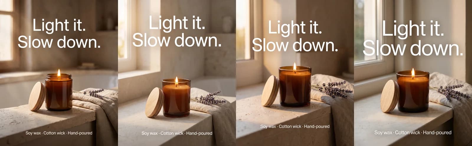 Nano Banana Pro · prompt: a lit amber candle jar on a limestone bath ledge, headline "Light it. Slow down." · 8 credits for four 4:5 variants at 2K · rendered 2026-10-20
All four came back usable, in 35 to 52 seconds, at 2 credits each. The headline and the sub-line were spelled exactly as typed in all four, checked at full size, and each file measured 1856 x 2304 pixels, above the 1440 x 1800 Meta recommends for 4:5 feed ads. The image tab in the dashboard takes the same four settings: the model, the ratio, the resolution, and one to four images per generation, so you can paste the prompt above into Novoads and get the same kind of set.
What it costs
Nano Banana Pro bills 2 credits per image at 1K or 2K and 4 at 4K, so the four candle statics cost 8 credits. Starter, the entry plan at $15 a month, includes 200 credits, enough for 100 statics at this setting, and every plan is on the pricing page. The cap strip earlier cost 5 credits a tile in September; the same four would cost 8 today.
What the run did not prove
Four variants of one prompt are one idea. Meta's December 16, 2025 note says its system "groups together ads that share key visual and thematic attributes", and that ads which look or feel alike "are seen as variations of the same creative." The four candle frames differ in crop and light, not in angle, so our reading is that Meta would learn from them as one creative. A real test changes the idea: the cap strip earlier in this guide is the shape of it, four formats for one product. How Meta scores look-alike ads is covered in creative diversity in Meta ads.
The headline is the other limit. Four words and one short sub-line sit inside Meta's warning about copy; a paragraph set on the image would not. For type that stays legible at feed size, our Nano Banana Pro ad creative test covers headlines and price badges.
A static ad is the cheapest question you can ask a market
One image carries one claim, and the results say whether the claim lands. Video earns its higher cost when the product has to move or the story needs time; nearly everything else can be asked as a still first, at 2 credits a question. Write the next prompt around a different idea, not a different crop, and let the numbers pick the frame worth turning into video.
Frequently Asked Questions
What are the different types of ads?
By format, Meta's Ads Guide sorts its specs into image, video, carousel and collection. By motion, an ad is either static (one still image) or moving (video or animation). By delivery, an ad is either fixed, showing everyone the same creative, or dynamic, assembled from a catalog or a profile for each viewer. The same split runs through social feeds, Pinterest, LinkedIn, display banners and billboards.
What are dynamic product ads?
Dynamic product ads pull products from a catalog and show each person the items the platform matches to them. Meta renamed them Advantage+ catalog ads (its help center writes 'Advantage+ catalog ads (previously dynamic ads)'), and its catalog page now files the feature under sales campaigns as 'Products from your catalog', using product data 'to show the right products to the right people.' Pinterest's dynamic carousels pull cards from your product groups the same way.
What is the difference between static and dynamic ads?
A static ad is fixed: everyone who sees it gets the same image and the same words. A dynamic ad is assembled at delivery, from a product catalog or the viewer's profile, so two people can see different products or details in the same ad. You design and test statics; you feed dynamic ads a catalog. Most accounts run both: statics to test angles, catalog ads to match products to shoppers.
Are static ads better than video ads?
Neither wins everywhere. In a 2014 Meta test of one US advertiser, two static ads in a row drove the most site traffic, while a video followed by a static drove the most online transactions. Statics also cost far less to make: 2 credits for a 2K image in Novoads against 72 for an eight-second Google Veo 3.1 clip. Use statics for angle tests and traffic, video for products that need to move, and let delivery mix them.
Key Takeaways
- A static ad is a paid ad built from one still image, with the headline, product and offer fixed in the frame. Meta, LinkedIn, Pinterest and Snapchat each sell a single-image format under their own name.
- Statics win at clicks, speed and volume: in a 2014 Meta test of one US advertiser, two static ads in a row drove the most unique site traffic, and in Novoads a 2K static costs 2 credits against 72 for an eight-second Google Veo 3.1 clip.
- Video earns its cost when the product has to move or the sale needs a story first: in the same test, a video followed by a static drove the most online transactions, and a LinkedIn agency got 85% more high-intent leads at a 52% lower cost after swapping static image ads for document ads.
- Meta's Ads Guide recommends 1440 x 1800 pixels (4:5) for Facebook Feed image ads. It is a recommendation, not a requirement: the technical floor is 600 pixels wide and 750 tall.
- Meta treats look-alike ads as variations of one creative, so test different ideas, not different crops. Our four candle statics from one prompt cost 8 credits and came back spelled right, but they are one idea.
Sources
- •Meta Ads Guide: image ads in Facebook Feed
- •Meta for Business: Photo ads
- •Facebook IQ: Creative Combinations That Work (2015)
- •Meta for Business: Demystifying Creative Diversification
- •LinkedIn Marketing Solutions: MHR case study
- •LinkedIn Marketing Solutions: Tilt Metrics case study
- •Pinterest Business: Review ad specs